If you are looking into website builders, it can be overwhelming. Two of the most popular choices are Showit and Squarespace. Each one has different pros and cons, and in this article we will look at Showit vs. Squarespace so you can make an informed decision for your online home.
Showit is a website builder that is known for their creative freedom, while Squarespace is better if you need more ‘extra’ features in a website builder.
Let’s dive into the different aspects of Showit vs. Squarespace from design flexibility to price to SEO to determine which website builder will be perfect for you.
The Design Approach between Showit and Squarespace
The two website builders are very different when it comes to designing. If you love a blank slate where you can drag and drop anything, turn and twist elements, and layer – Showit is going to be your builder. You are met with a completely blank page where you can drag and drop any elements. You can think of it similar to Canva, with the freedom to design how you wish but the options to use templates as a starting point.
Squarespace is the opposite where you are selecting pre-designed templates in more of a square, box format. This is actually a positive if you are someone building a website from scratch and want to just piece together a website to be used. You can DIY your own website with minimal customization to achieve a polished look.
If you are someone that wants to DIY your own website and does not need or want a high level of customization and creative freedom, than Squarespace is your choice. If you are someone that wants to be more creative and start with a blank slate, than I would go with Showit when it comes to the design approach.
When I jumped into Squarespace to just try out designing my own home page, I was super frustrated. I don’t like to be forced to create in a box and I couldn’t add elements like I wanted to. My Showit site has a lot of layered elements, and although you can do that with code in Squarespace, I am not proficient in code or want to learn!
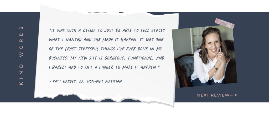
What my testimonials look like on Showit:

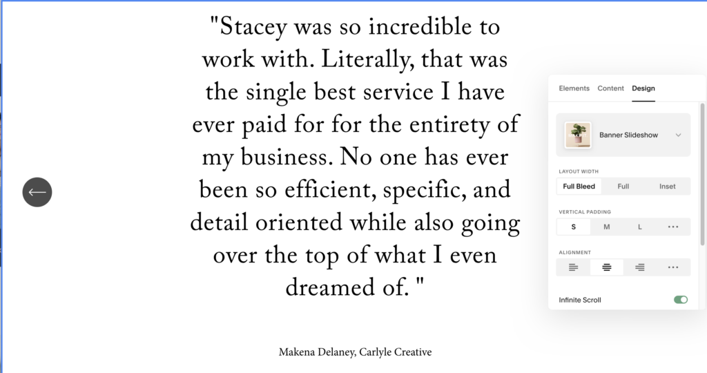
What my testimonials look like when I tried to create it in Squarespace (with no code):

Pricing Plan Comparison with Showit and Squarespace
Showit’s pricing plans are tiered subscriptions that can be monthly or annually. You would choose their pricing plan based on your blogging needs.
Squarespace has straightforward pricing plans with a lot of features built into their platform. Built-in features include things like e-commerce, members-only areas, client portals, email marketing, scheduling, and so much more. This makes it super convenient for users. You can do all of those things with Showit but you will always be connecting externally. Even the blog portion with Showit you have to log into a separate URL since it is powered by WordPress which is great but still not as convenient as Squarespace.
I would suggest looking at your business and figuring out how many ‘extra’ things you need. If you are just starting and wanting everything in one platform, Squarespace will probably be your best bet. If you are starting with a straight-forward website and want it to be focused on design, then you want to go with Showit.
Support between Showit and Squarespace
For me, customer support and being able to find things on my own is HUGE. I do not want to be part of a long queue, have to call someone or have it virtually impossible to find an answer on my own. Showit’s customer support is the best. You have a little chat icon in the corner of your website builder that you can send a message to a customer support representative. Any support person that responds in GIFs is definitely my favorite. Showit also has a huge library of online help tools and videos, and they share a ton of how-to’s on their social media. Squarespace does have 24/7 email support and a community forum, and they also offer webinars and workshops. To me it feels like Showit gives a more personal, intimate customer support experience so I would always choose them in this category.
A few chats with Showit customer support…


Real Life Scenarios
Again, choosing a platform can be really specific to your business needs. It depends on what you want in a website, a pricing plan that meets your needs, and how easy it is to update and customize your own site just to name a few. To help with your decision, let’s outline a few different scenarios:
Meet Sarah – she is a photography that loves designing. She wants a website that shows off her portfolio of destination weddings. She wants to be able to make updates on her own, and is familiar with blogging in WordPress. Sarah would be perfect for the Showit platform. With Showit’s customization options and the ability to continue blogging in WordPress, this will help Sarah bring her creative vision to life and attract new clients impressed by the unique design of her website.
Meet Kelley – she is just starting her handmade jewelry business, and is somewhat techy. She knows what looks good but doesn’t need anything too fancy. She wants to be able to add in a shop to her site easily and manage it from one platform since she only has a few products. Squarespace would be the best platform for Kelley to start with. With Squarespace’s intuitive editor, Kelley is able to pick the layouts that work for her and update them herself. The simplicity of Squarespace will be easy for Kelley and she will be able to showcase her products to potential customers.
Whether you prioritize design control like Sarah or value of use like Kelley, understanding Showit and Squarespace and how they cater to different user needs can help you make an informed decision when building your website.
Making the Decision
Honestly, no matter what you read it is going to be best to jump into each platform and see how it works for you. When I first started my website design business I signed up for all the free trials I could, jumped into the platforms, and started to try and design what I wanted. Each website builder offers unique strengths and weaknesses and I don’t believe you will know until you are in each one and experiencing it for yourself.
If you find yourself leaning towards Showit, I would suggest looking into a template to start. It will be MUCH less overwhelming to get a template and customize it then staring at a blank screen. I am obsessed with Tonic Templates and Elizabeth McCravy’s Templates. You will be able to just drop these website templates into your Showit account, customize and launch with minimal thinking. They are THE best in the Showit template world. Also, be sure to use my code for a FREE month of Showit when you sign-up!


_____________________________________
If you’ve stumbled on this blog post and asking yourself ‘who is this person that wrote this?’, I’m Stacey! I’m a Showit Designer and Developer, and I’m all about keeping things simple and stress-free. My designs are all about balance and clarity, making sure your message shines through without any clutter. With my video tutorials, I’ll guide you every step of the way, ensuring you feel confident and empowered to update your site whenever you need. No tech headaches here, just good vibes and great design. Check out my Showit design services and maybe we can work together in the future!
Also, I occasionally email some tips and tricks or fun stuff that comes my way. I am actually not a fan of email so when I send one, it’s worth it! I would sign up, or follow my stories on Instagram to get to know me more!
