When I first started my business, I started it as a Virtual Assistant business doing all of the things. I knew I wanted to be a business owner, but I wasn’t sure exactly what my niche would be. The first step in my head was to build a website. So off I went, starting to search for the best website builder. I didn’t know how to build a website from scratch, but I do know one thing about myself. I don’t like to be restricted to what I can and can’t do creatively.

Researching the best website builder
I looked at Squarespace because I knew of that website builder from my corporate job. Everyone talked about it, so it must be good right? Well…maybe. I started a free trial and started messing around in Squarespace and quickly realized I didn’t enjoy the restriction of the templates.
Next stop was a lot of Googling, and a lot of free trials until I landed on Wix. There were definitely some negative comments about Wix but I chose Wix as my starting point for the following reasons:
- I was just starting out and I wasn’t in love with the name of my business, and I didn’t have a focus. I just needed something that looked nice with the information I had.
- It was a website builder that was easy to use. I quickly picked up how to move around in the platform and it was basically a blank page to work in. I liked how I could drop things in however I wanted.
- Because of #1 I didn’t want to invest in anything yet. I knew I wasn’t feeling 100%, and Wix was a free website builder if I didn’t have a domain to connect to it.
Fast forward a few months…after lots of different types of virtual assistant jobs, and a notebook full of possible business names, and I had landed on what I knew would be my focus. I purchased a domain and knew exactly what website builder I wanted to work in…Showit.

Showit is the best website builder!
I love, love, LOVE Showit. It is a website builder that is easy to use and design beautiful websites in. I discovered Showit after seeing it pop up in many of the Facebook groups I was in. I started their free trial and started with one of their many free templates. I used a lot of the help documents Showit provides in order to work my way through building a site.
Here are a few reasons why I believe Showit is the best website builder to work with:
1. Easy to update design settings
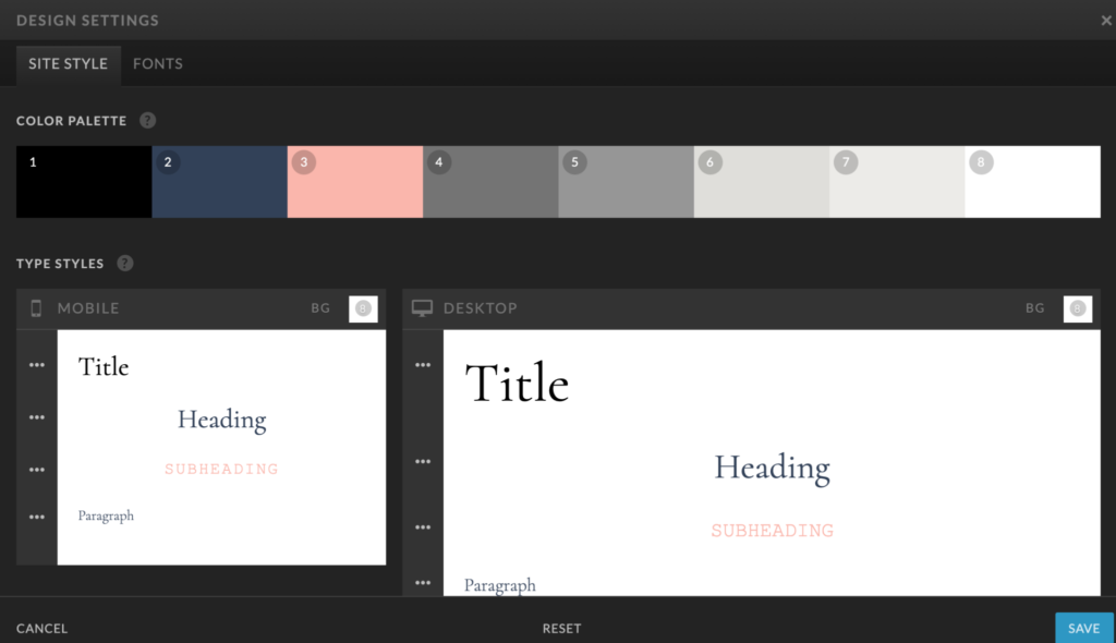
When you are using the design settings throughout the site, it makes it SO easy to update things like font or colors. The design settings allow you to set the color palette and the font settings once, and then use those settings throughout the site. This means if you update the Heading color to Blue instead of Purple in the design settings, it will update every text that has been assigned the ‘Heading’ text throughout the entire site. It also creates a ton of consistency throughout your site. You know that every paragraph will have the same exact settings when you add text, and you don’t have to keep looking for that ‘perfect’ blue shade because it’s already there for you! If you are looking for more details about the design settings, check out this blog post.

2. The ability to design mobile and desktop differently
I remember when I used Wix it was so difficult to make the mobile design look perfect. Showit allows you to design the mobile site and desktop site completely different. The possibilities are endless but a few key examples would be:
- You could have 5 images on desktop, and maybe only show 3 on mobile.
- You could have a design element on desktop, but hide it on mobile.
- You can have the text designed differently on desktop vs. mobile.
The majority of website visitors are viewing on their mobile device, so the ability to cater to this method of viewing is key to converting your website visitors!
The below image is one of the FREE Showit templates that are available to you. This one is called Gimlet by the Tonic Site Shop.

In this example you can see the there are three images on the desktop, but only one on mobile.
3. The functionality of WordPress for blogging, and the beauty of Showit for the rest.
When I was researching website platforms, WordPress was definitely the number one platform everyone was recommending. I didn’t believe WordPress was the right platform for me though. I’m a designer, not a developer, and I was worried about updates and coding and things breaking, so WordPress scared me. I found out that Showit actually uses WordPress to power the blog portion and I immediately felt like I was getting the best of both worlds. You still have the ability to use plug-ins like Yoast to help support SEO, and any other plug-ins your business may need, but you get the ease of using Showit to display your website and blog.
4. The ability to have creative freedom in the website builder
The number one thing I wanted in a website builder was to be able to put things wherever I want…and Showit definitely allows that! If I want to turn a text in a weird way…I can do it. If I want to add an accent in the middle of the page and move it above the text…I can do it. I am definitely someone that can figure out coding and all that fancy stuff…but why Google all of that when I can just plug-and-play in my design? I love the freedom Showit gives you to be creative. The design limits are endless. Even on my own site, I was able to use pieces of paper to add some design accents overlapping canvas’ and turned in different ways for a little extra design features.

5. The Showit Designer Community
I was part of the Showit User Group even before I was on Showit, and as I stalked that group (in a non-creepy way), I felt like every designer in that group was so helpful, nice and supportive to everyone. I started following Showit Designers and connecting with them, and felt like it was just an amazing community of people. I even decided that part of my business would be to offer white label design services to Showit designers. The support team, fellow Showit designers, and creative entrepreneurs that use Showit all have this amazing community vibe that I love to be part of.
Is the Showit website builder right for my business?
Although I LOVE Showit and I think everyone should use it, I believe that the website platform has to be a perfect match for your business. If you are an e-commerce company selling hundreds of products, a website platform like Shopify or Squarespace might be better for you. If you are just starting out and need a free site until you are ready, maybe Wix would be better. It is important to do your research, use the free trials, and go with one that you LOVE. If you need help deciding if Showit is right for you, I would be happy to help!
